New UI for Piano 3D: Requirements
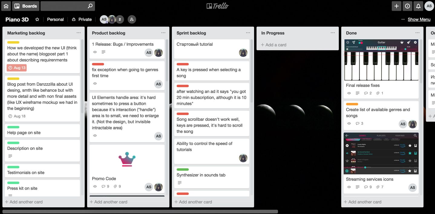
As I said before, iOS and Android version of Piano 3D required a new UI and UX, because the Windows Store app’s design was ugly, just default gray controls from Unity 3D. Fortunately, I have a friend who agreed to help me with the visual appearance of the app. So in the summer of 2016 we started working on requirements and first wireframe prototypes.
This post is about the process of defining and discussing requirements of the new UI and the challenges we had.
Before we started working with my friend, I was the only person who worked on Piano 3D. So the whole process, all ideas and key moments of the app were entirely in my head and in my OneNote.
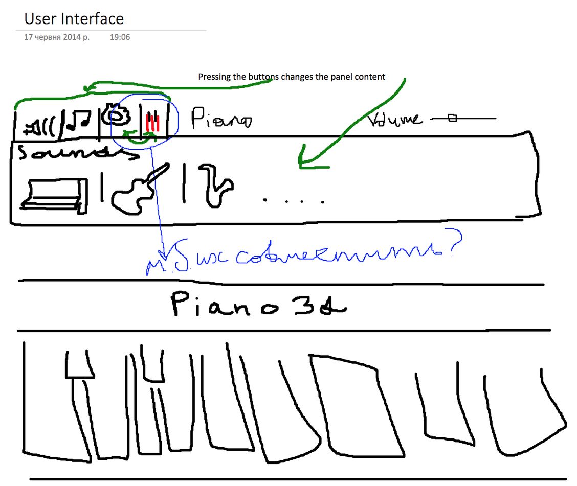
Just for fun, this is my own mockup from OneNote:
But I knew, more or less, what I wanted, so the goal was to explain everything to a man who knows next to nothing about the app. I created a document which had all the features described and we also had a few skype calls to go through everything in the document and brainstorm some ideas.
There were 6 areas in the app:
- main screen
- tutorials
- subscriptions
- sounds
- settings
- synth settings
The specification document had 5 corresponding pages (excluding the main screen), I’ll provide a slightly edited version here. I’ll also give some comments in italic because we changed smth during the discussion.
Specification document
The app is landscape only. The main screen’s UI should be minimalistic so that users can focus on playing piano.
Tutorials
Tutorials allow users to practice some songs which they select in a menu.
There will be a hierarchical structure “Genres > Artist > List of songs”. We need a kind of “Back” button.
Option 1: “Pop-rock > Coldplay > Adventure of Lifetimes” breadcrumbs, a click on “Pop-rock” results in navigation to “Pop-rock” page.
Option 2: Just a back button which navigates a user to the previous screen
We simplified this by having only “Genres > List of songs” sections, so the second option, back button, was a natural choice.
“Search > List of songs”. A user inputs smth, we show him corresponding songs. There is a back button leading to the main “genres” screen.
“Playlist > List of songs”. Something like “Top 100 rock songs”, “Editor choice” etc.
We need a way to feature new songs when we add them.
Later we decided to have a special playlist called “New songs”
“Favorites” - a list of songs a user likes, there should be a way to add and remove each song to the favorites.
In the free version of the app we need to show that some songs are not available for practice (blur them?). When a user selects such song we open a popup with text “This song requires a subscription” and with two buttons, “Buy subscription” leading to the subscriptions page and “Watch ad” which initiate an ad and reward 10 minutes subscription at the end.
On the main screen of the app there should be a way to start and stop the tutorial and a checkbox which indicates if the keys should be pressed automatically.
Later we agreed that we also need to show the current song on the main screen.
Subscriptions
There should be a button which opens the subscriptions popup. In this popup users can buy one, three and six months of subscription.
Sounds
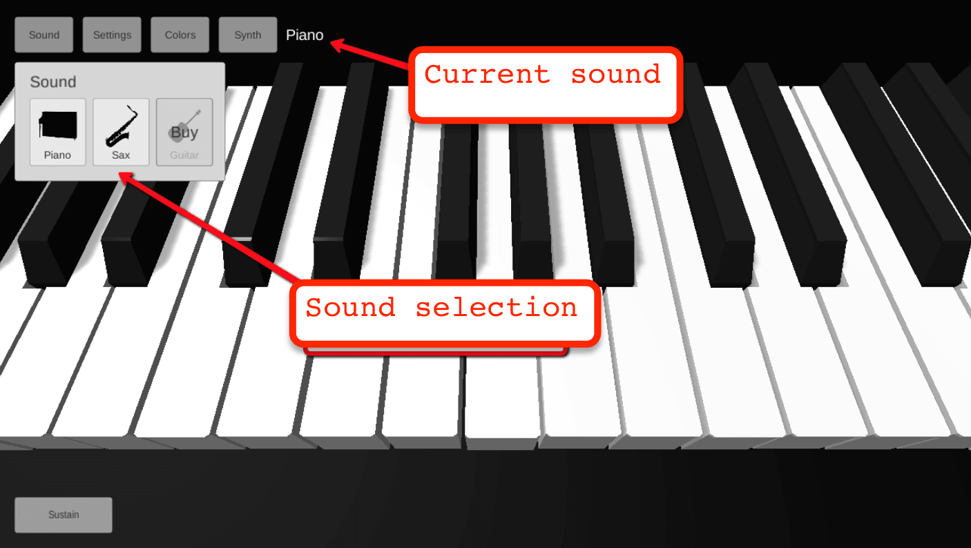
A user needs a way to change sounds (piano, guitar, sax). It should be clear which instrument is selected. The old design as an example:
Settings
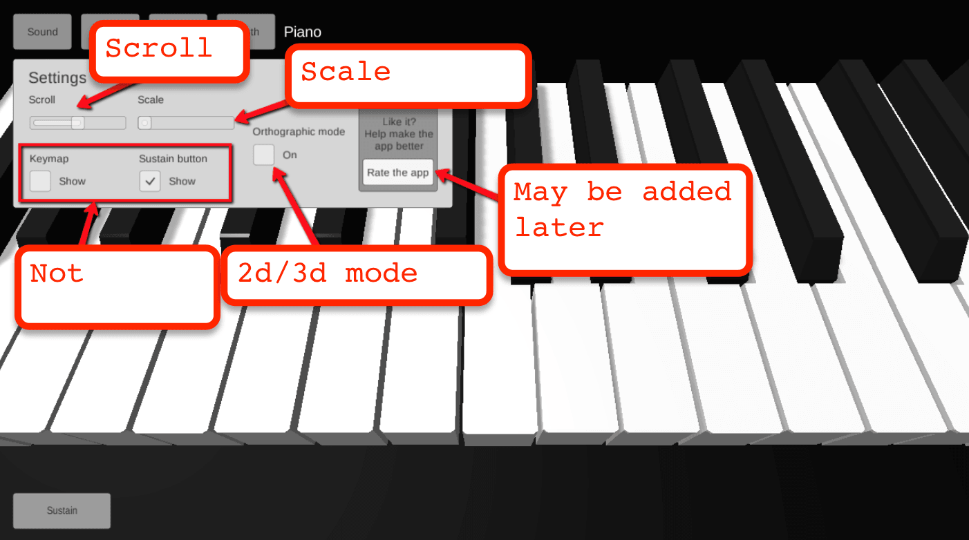
In the settings menu users can:
- scale
- scroll
- enable 2d or 3d mode
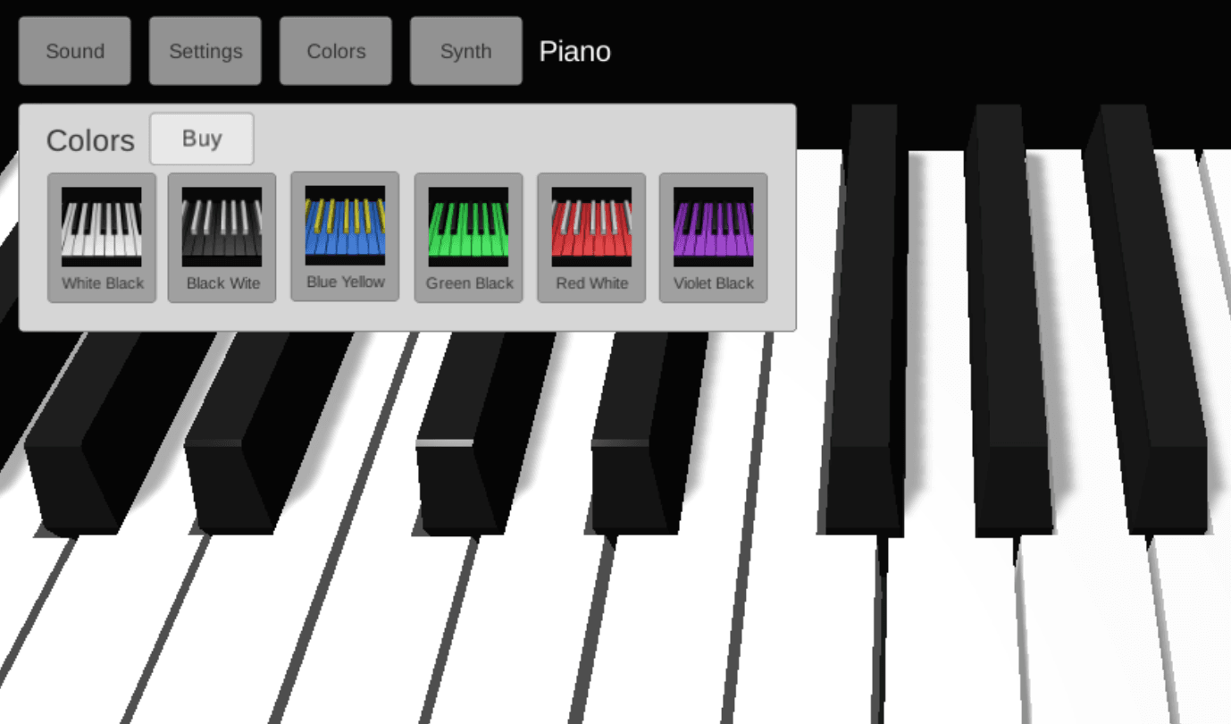
- change colors of the keyboard (possibly a submenu)
The old settings menu design:
The old color selection menu:
Synth
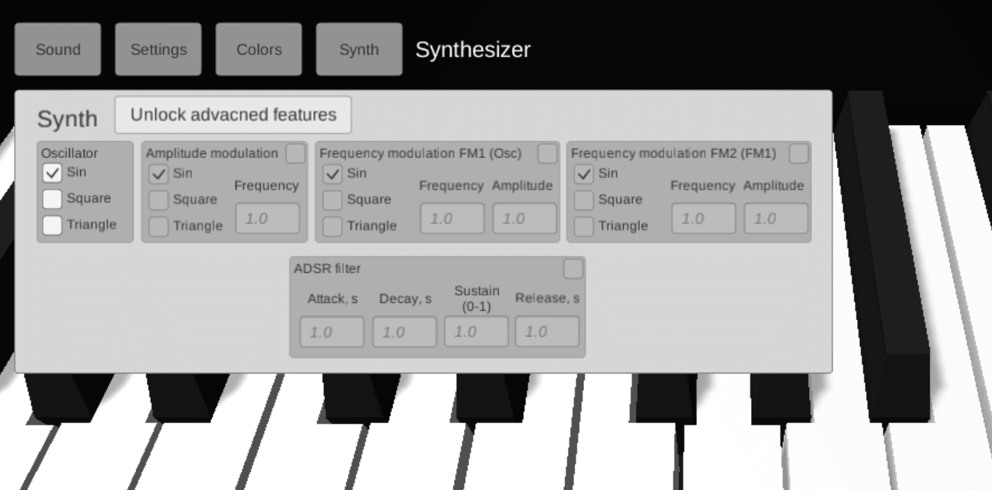
Synth is a separate instrument in the sounds tab, it should have a synth-setting menu which corresponds to this one:
That’s the whole document.
Conclusion
This document combined with skype meetings allowed us to finish the new design in 1,5 months (this is a side project, remember). The next post will be much more interesting, it will describe the process of UX and UI design from the designer perspective, so stay tuned.
And of course, you can check the result in the app, get it from piano3d.com.